Structure
Apparel graphic
Tryon Solutions provided consulting and services for the warehouse management industry, but quietly began developing Cycle in the background to help streamline the process. When it came time to reveal our work, I wanted our demo team to stand out among the crowd.
Concept
Normally I conduct considerable research on every design project in order to better understand my topic and make more interesting relationships between themes and graphics, but this instance was a little different. I was present for Cycle’s conception and intimately involved in its creation — I designed everything from the application logo to the user interface.
Over four years’ worth of discussions with Leadership, Product, and end users had given me insight into the perfect theme:
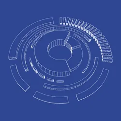
- Blueprint — Cycle provided a means for users to structure their tests in a meaningful way. Test engineers could write modular Features and Scenarios and organize them in any number of combinations to create the perfect Test Suite for their warehouse. We were allowing our customers to plan their rollouts and upgrades in the same way an architect might draft a building: everything made to measure and no surprises.
What I was going to make was clear, but how I was going to make it was another matter.
Process
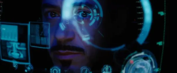
Most of my research time was shifted to this phase of the project and involved looking at circular architecture like Apple Park in Cupertino and GCHQ in Gloucestershire, as well as radial UI elements like you’d see in science-fiction movies. From this process, I landed on the following criteria:
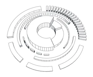
- Radial arrangement — Setting the Cycle logo at the center of the arrangement and working outward would show how the application serves as the core of a WMS testing operation and would flow meaningful information outward into the rest of the supply chain.
- Asymmetry — Each Test Suite is complex and variable, even for similar warehouses owned by the same company. The test development process is just as varied: the initial setup may involve a single long, focused effort while later changes may be comprised of a number of shorter pushes.
- 3D wireframes — In addition to being cool technical elements, wireframes also symbolize a plan. They are useful models, giving shape to a system while still allowing for review and adjustment prior to development.
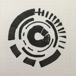
I began my sketching by practicing circular arrangements with a chisel-tip marker so I could rotate the broad edge while drawing to create thick, thin, and broken variations of a stroke.
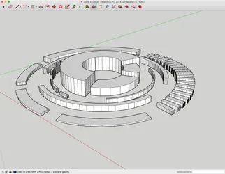
I imported the most promising one into Illustrator and redrew it using circular paths, then moved those vectors into SketchUp for extrusion. Within SketchUp, I gave the individual elements dimension: The Cycle logo served as the hub and highest point, while the most external elements were the lowest. I wanted users to understand that Cycle was something they could use to anchor their testing efforts and build out as needed.
After selecting the primo camera angle to capture the mark and arrangement, I exported the model back into Illustrator for final editing.
Outcome
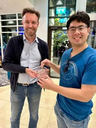
The shirt graphic was a last-minute request, resulting in a short run printed just in time for our reveal. Their limited natured made them highly-coveted among employees, with the handful of leftovers serving as prizes at company events.
The application logo changed after Cycle Labs spun out of Tryon Solutions in 2021, turning this graphic into a historical artifact. While rare, they have been seen in the wild as recently as August 2024 and mark its wearer as an OG Cycler.

