Ruckus
Climbing gym brand
The team behind Ruckus discovered a love of indoor climbing through their daughter, who took an interest in the activity at a young age. Dissatisfied with the lack of climbing options in their area, they built a new facility and wanted an identity to match the rambunctious spirit of kids and the kids-at-heart.
Concept
Working with the Ruckus team, I developed a moodboard to serve as a visual menu of ideas that we could draw on to develop a brand. Using this board, we created a list of qualities that we wanted to include:
- Dimension — Depth in addition to width and height.
- Primitive forms — Big basic shapes that look like something you can climb on.
- Rhythm — A playful vibe that echoes the energy of a day of fun.
- Punchy colors — Avoid primary colors and instead opt for more bold natural tones that can be mixed and matched and still work well together.
Additionally, I did a competitive analysis of other climbing gyms in the state to see what we could learn from their identities. This took the form of a simple tier list, where I ranked other climbing gyms based on the quality of their logo concept and execution. (I would like to point out that my ranking is not an indictment of the facilities themselves.)
This process immediately highlighted two tropes I wanted to avoid: literal depictions of mountains and climbers. Anything else was fair game.


Process
One thing Ruckus co-owner John was upfront about was the fact that they were operating an indoor climbing gym and that he saw the angular walls and colorful handholds as features to be appreciated. After all, he envisioned this gym as a place for climbers to practice off-season and for youths to develop a love of the sport. His position dovetailed neatly with my “no mountains / no climbers” sentiment mentioned earlier.
As I researched indoor climbing further, I understood what he meant. There was an exciting quality to all the big angular shapes that make up a good climbing wall, and these features laid the groundwork for the rest of my exploration.
- Climbing walls — These imposing shapes reach from the floor to the ceiling, bulging outward and caving inward creating a sense of drama, scale, and motion.
- Volumes — Geometric prisms cut on a bias and attached to the walls offered climbers variety to their ascent, and in them I saw opportunities to create dimension and texture for the final mark.
- Handholds — Their small size and colorful organic shapes provided a counterpoint to the large angular walls. Also, their variety of forms meant that they could potentially be exploited for typography treatments.
With these ideas in mind, I got to work. I developed visual themes based on angular bouldering walls, cut up paper shapes inspired by volumes to create custom type, and reimagined handholds as organic letterforms.
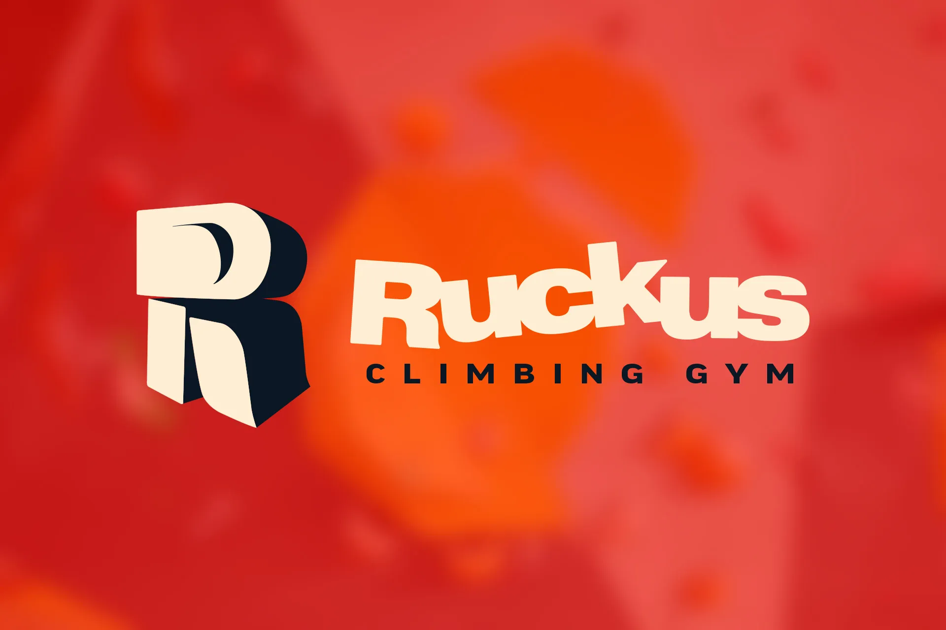
While I was very close to the mark, I received feedback from co-owner Kendra that set the project on its final track: She wondered if rendering the whole business name would make it difficult to read at a glance, say as a sticker on the back of a car. John, followed up by saying that he really liked the three-dimensional ‘R’ that appeared in each of the options. In response, I turned my attention creating an monogram/icon and wordmark that retained all the concepts we’d settled on earlier but in a tighter package.
I imagined the icon as an imposing climbing feature — tall, thick, and weighty — something with dimension and a form that a person could conceivably ascend. Rendering it in extreme perspective gave the impression that a climber was in for a challenge. However, tumbling the individual elements implied a sense of looseness and variety that satisfied the desire for rhythm we identified earlier in the project. It was clear, I had found a winner.
I made a point to apply the same line of thinking to the wordmark: I tested a few bulky typefaces to find the right heft while deciding how best to jumble the baseline but still maintain legibility. The final arrangement had the right amount of energy without appearing too childish, and could stand on its own without the icon to support it.
Regarding color, I referred back to the swatches on my moodboard, selecting colors that came from nature but also had presence, like red clay, mustard yellow, ocean teal. Rather than picking just one, I opted for a modular approach where I selected pairs of colors that would contain enough contrast to maintain legibility at a distance while allowing the Ruckus team the freedom to mix and match as they saw fit.


Outcome
The final mark was well-received by the Ruckus team, who immediately got in touch with their signage contact to being constructing a steel replica for the front of their gym.
Additionally, I was asked to design a quick digital advertisement for a local outdoor climbing publication featuring the new logo. Even though that project mandated the use of literal mountains, I was able to render them in the style of the logo creating an internal logic that neatly combined the rounded shapes and colors of the mark with the angular forms of a mountain range.
The ad drove considerable traffic to Ruckus’ Linktree site, and in turn boosted first-day attendance far beyond what John and Kendra expected.


