Cycle Release Updates
Video Editing & Motion Graphics
While the Cycle Labs Product team dedicated serious effort to shipping new and requested features, we noticed that their adoption rate was lower than we expected. Teammate Andy and I put our heads together to rectify the issue.
Concept
As Cycle Labs and its software offerings began to mature, the Product team recognized the need for user metrics and telemetry. The organization’s client base was steadily growing and the businesses we served were increasingly high-profile; finding out what mattered to them was paramount. However, getting quality feedback from individual users was becoming more difficult, so Cycle Labs coordinated with Pendo, a local product experience platform, to begin collecting insights.
I was responsible for handling the integration of Pendo into our codebase, creating segments of users that represented different demographics, and adding useful targets to our UI that the analytics package could track. Once in place, the metrics showed us not only current usage stats, but also historical ones, looking back to the moment we first added their package to our app. When reviewing the statistics, one thing became apparent, users were not taking advantage of the new features we’d recently developed.
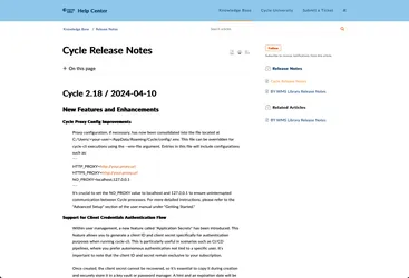
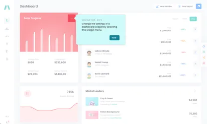
Historically, new features were announced via marketing content and a link to the release notes hosted in the company’s knowledge base. I recognized this was likely doing us a serious disservice by creating too much friction between the announcement and the actual instructions users needed to adopt the feature. In response, I prepared a Pendo Guide — a popover with containing information related to a given UI feature — for each new release.
These guides ran once on launch and highlighted some component, like a new button or panel within the application, and then provided a series of steps on how to interact with it. They boosted engagement temporarily, but the figures always dropped over time, with users settling back into their previous behaviors.
The burning question I had to answer was “why?”
Process
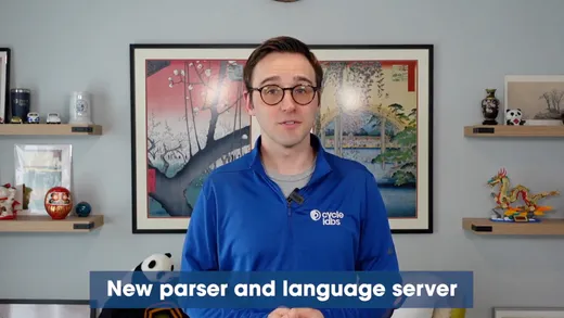
Teammate Andy, who had recently joined the company, had an idea. He figured that showing was better than telling and recorded himself interacting with a feature while narrating his actions. Adding his video to the next release guide boosted engagement with new features for longer. We’d finally found a way to make the information stick.
While a talented speaker and educator, he would tell you himself that video editing and graphic design were not his strengths. But they were areas where I excelled, and by combining our talents, we could create walkthrough videos that were guaranteed be as polished as they were informative.
Andy wrote the scripts and recorded his own footage, which I would then edit and assemble in Final Cut Pro. My workflow included color correction, audio equalization / normalization, and the application of graphics.
While customer satisfaction is at the forefront of my mind as a product designer, I also faced the fact that this was an unofficial project and I would be afforded no extra time to create these videos, so a streamlined workflow was critical.
Using Motion, I created a graphics package with the following elements:
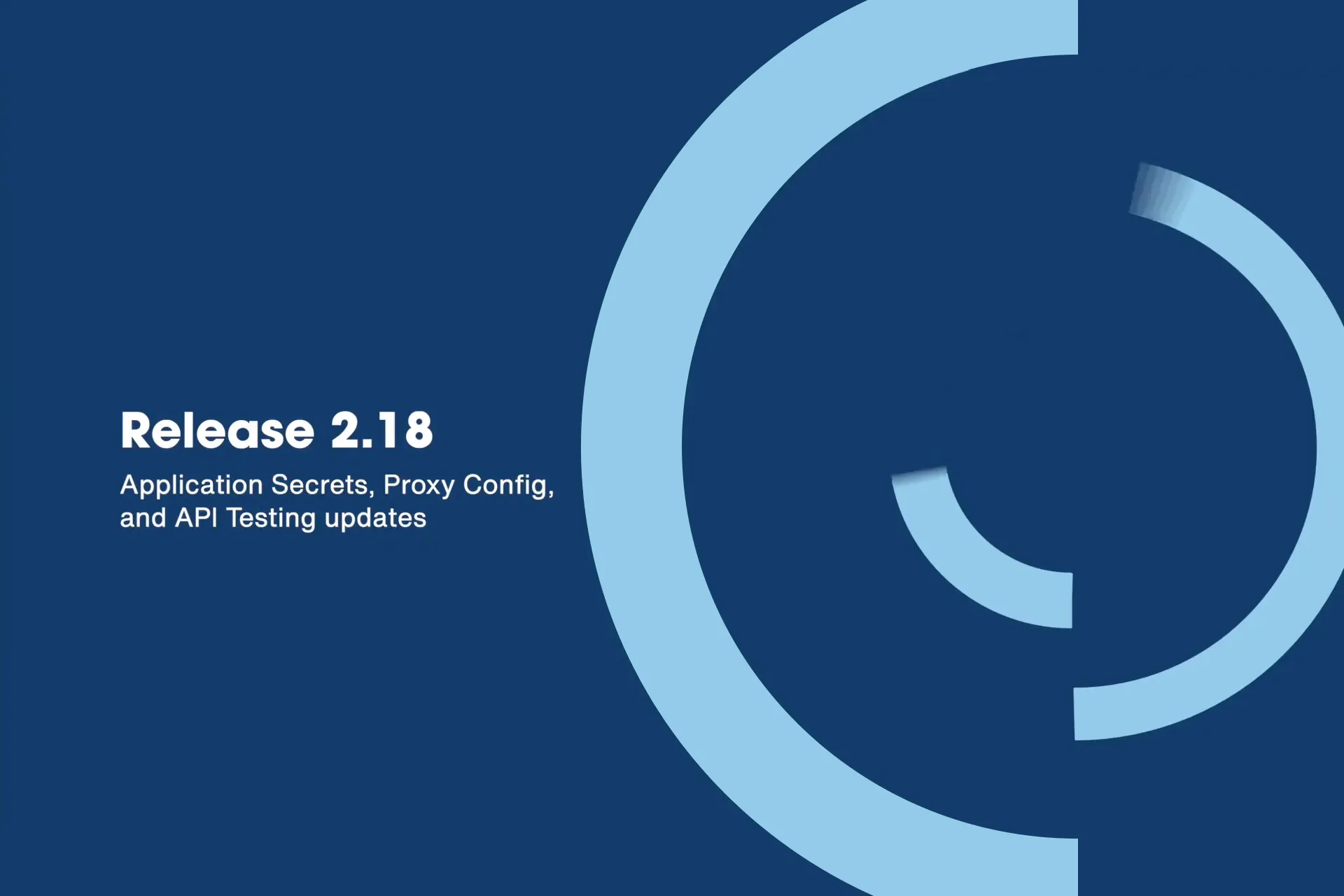
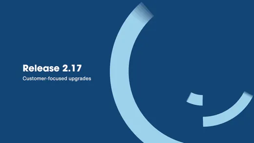
- Bumpers — Animations that precede a video help provide context to the information to come, while closing graphics provide an opportunity to call to action or reinforce a brand. I designed the opening bumper for based on an echo-like element presented in the company branding guide. Staggering their exit from the screen created some light visual interest while not distracting from the text introducing the topic. Thinking ahead, I made sure to expose the title and subtitle content directly to Final Cut so that I never had to touch that particular animation again, only update its text content.
- Titles — Text elements can introduce a speaker or reinforce information spoken in the footage. I created a reusable title element that expanded to fit its content, reducing the amount of time I spent creating text elements for the video.
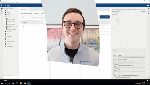
- Transitions — I needed a few ways to smooth the scene changes between a presenter and screen recordings of Cycle, so I created two custom transitions based off the animation presented in the opening bumper. One would enter from the middle revealing our speaker, then expand outward to fill the frame. The other would enter from the left and expand right, opening up to showcase a software demo.
This package dramatically reduced my editing workload and gave my videos a consistent, on-brand aesthetic.
Outcome
I produced three walkthrough videos for Cycle Labs and each one significantly boosted engagement with the new features they advertised.
Users demonstrated more confidence having been shown how to perform an action and were inspired to offer more feedback via a comment box and rating system added to each guide.
