Level Up
Mobile fitness brand
Fitness professional Jonathan came to me with an idea: To take his personal training business on the road. While he possessed the skill and a van, what he lacked was an identity that captured his energy and strength.
Concept
Jonathan and I both worked at a local gym as a trainer and group fitness instructor, respectively. I watched him lead personal clients and small groups through high-impact boxing-inspired workouts and his energy was infectious.
After training with him for a few months, he revealed to me that he was dissatisfied with the conditions of his employment and was considering going independent. However, he was disinterested in turning his home into a fitness center and instead wanted to engineer a truck or van into a mobile studio, drawing inspiration from companies like Fit Truk in Kansas City.
In this moment, our roles reversed. I became the trainer for his brand, dedicated to whipping it into fighting form. We discussed his business goals and his brand requirements, which led me to the following criteria for success:
- Change — Jonathan’s whole purpose for being a trainer was to help people build better lives by changing their habits. Whether its by eating healthier food, moving more frequently, or adjusting one’s workout regimen, these small changes add up over time and the mark should reflect that.
- Action — Box fit workouts were holistic, focusing less on building individual muscle groups in isolation and more on the body as a whole. His sessions would have participants running laps, jumping boxes, lifting weights, and throwing punches to increase their fitness. I wanted to make sure that this element of energy and motion featured prominently in his brand.
- Fitness-focused — The concept of leveling up may have originated in gaming, but the Level Up brand was all about getting people off the couch and on their feet. Jonathan wanted to avoid creating a relationship between his training and a generally sedentary activity.

")
Process
As I began sketching, I looked for ways to interpret the stated concepts into a visual language.
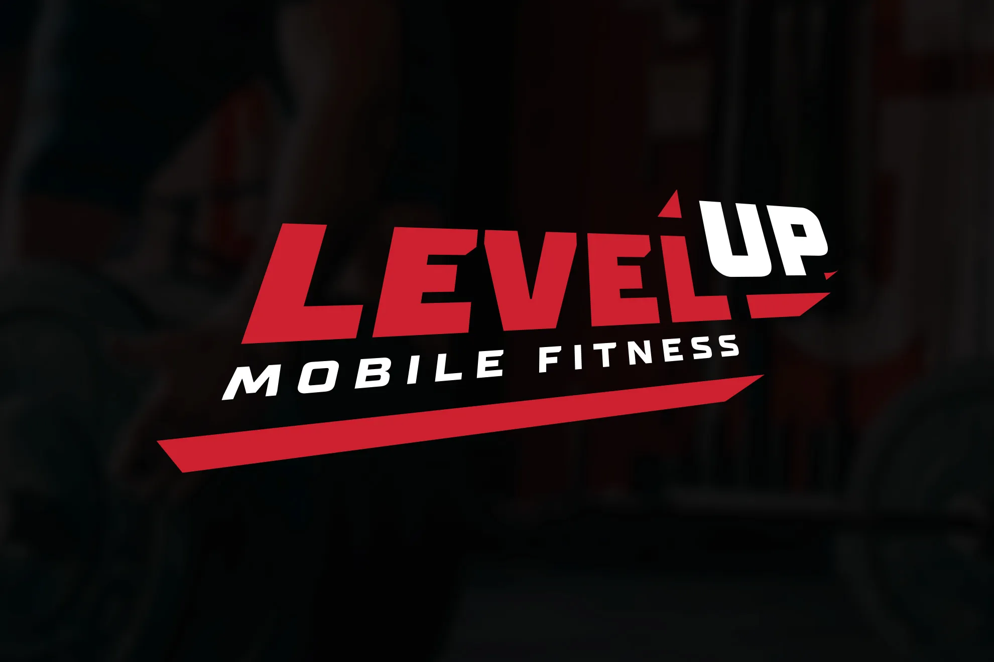
- Arrows — Given that change and action were to concepts I wanted to highlight, arrows seemed like a natural fit. They point the way to a destination and imply action in the process. Additionally, there were some interesting relationships I could develop between the right angles of a capital L and those of a boxy arrow, setting the stage for a possible monogram.
- Dimension — Change and action could also be represented as differences measured over time. A client could lean out after modifying their diet or bulk up as a result of regular strength training. I was interested in finding ways to show these differences using dimensional forms, for instance, setting the ‘Up’ in Level Up on a higher z-axis on a 3D model.
- Impact — Even the least physically-adept client would notice the effects regular exercise had on their body; all that mattered was that they showed up and put in the work. In Jonathan’s mind it was black and white: If you put in any effort at all, it would pay off over time. I looked to replicate his philosophy visually with a high-contrast color scheme and bold type.
My early vector work focused on the use of directional arrows and creating dimension through two-dimensional perspective, but the most meaningful ideas emerged once I took the concept into three-dimensional space.
I experimented with differing heights for the text elements, adding thickness though extrusion, and motion via extreme perspective. As I adjusted different elements like the color of the extruded material and lighting of the model, I discovered an interesting relationship between the second L in Level, the word Up, and the shaded portions of the model.
If I removed the background of the model, the shaded areas would pretty closely align with that second L, which could be further embellished to create an optical illusion appearing to raise the rest of the text on the z-axis. I tested this idea out with both Up and my arrow concept, leading me to create two versions of the mark: one full text and the other an abridged iconic variation.


Outcome
I delivered two color variations and two formal variations for the final mark: A light and dark version that would account for differing background colors, as well as full and abridged takes on the mark which would allow for consistency across a number of applications.
For instance, the icon could be used for favicons and profile pics where space is limited, while the full-text version would serve well in larger formats like van wraps and signage.
I also included a few usage examples like merchandise mockups and a sample van wrap to show how brand elements could be used on his vehicle.
Jonathan was thrilled with his mark and immediately began coordinating with his automotive partner to incorporate it into their up-fit.


")