Labsday 2022
Apparel graphic
After a full year under the name Cycle Labs, Leadership decided to honor the founding of the organization with a company-wide holiday: Cycle Labs Day. When the CEO asked me personally to create a shirt for the event, I was eager to deliver something special.
Concept
During our initial discussions, Josh, founder and CEO of Cycle Labs, had only two requests regarding the final design of the shirt. He asked to include the following two phrases somewhere in the graphic:
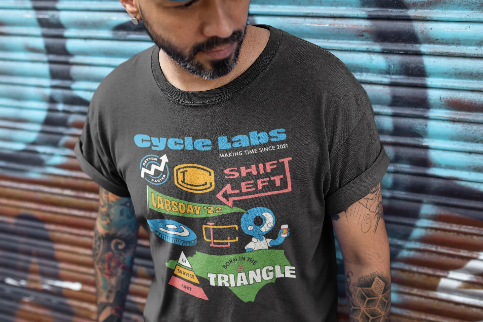
- Make Time — When founding Cycle Labs, Josh emphasized this phrase and its multiple meanings in regards to our work and culture. Our software aimed to make time for warehouse employees by automating the testing process, we as teammates were meant to make time for one another in regards to solving problems, and Cycle Labs Day was created as a way to make time for employees by giving them an extra day off.
- Cycle Labs Day — This one was far more obvious, its the day we are celebrating after all. I was able to negotiate this down to ‘Labsday,’ a new day that could have its own special positive connotation like Friday or Saturday.
Once the hard requirements had been set, I started thinking about the company, what it meant to me, and what we had experienced over the last year.
")

Process
Start-ups, like children, grow and change quickly. They develop their own culture, habits, activities, and ways of thinking. I used this framework to rough out some ideas for the project.
- Baseball — Around April 2022, the company attended an all-hands meeting on site, then afterwards were treated to a Durham Bulls game in the VIP section. Many of us were diehard fans of the sport, so borrowing from baseball-style graphics like team monograms and old-school brush scripts seemed like a reasonable avenue.
- Historical brand — I also recalled a time where Josh spoke about wanting to make Cycle Labs a sustainable and long-running enterprise, something that he could potentially hand down to his kids. I imagined what a Cycle Labs logo would have looked like if designed a half-century prior, like a 1950s car badge.
- Company artifacts — Due to the remote-first position of the company, many of us communicated only by Slack, where we developed a series of memes, emoji, and inside jokes that continued long after their original creators had left the company. Additionally, software testing had a lot of similar artifacts, such as the testing triangle and phrasing like “shift left,” that is impenetrable to folks outside the industry. I sought to find a way to surface and combine these ideas into a cohesive unit.
While working on vector versions of the car badge and baseball concepts, I felt like the ideas were relatively strong, but not enough to anchor the entire graphic. However, once I started combining them into a single layout, they took on much more power. Each individual element was like a chapter, and together they told a full story — the first year of Cycle Labs.


Outcome
Josh was stoked with the final product and spent a few minutes reminiscing over the events and conversations that inspired the graphic. At that point, I knew I’d captured the spirit of the request and looked forward to everyone else’s reactions.
The shirts were distributed, the team responded positively, and I considered my mission a success.

