Jacked
Men's fitness brand
When local gym RipXFit wanted to start a new men's fitness class, owner Jean-Pierre said he already had a name in mind, but wanted something powerful to serve as its mascot.
Concept
RipXFit got its start as a training facility for Spartan races, events that combined trail running with strength and agility obstacles like monkey bars, bucket carries, and wall climbing. As his client base grew, JP began to offer more general fitness classes for those that desired the same workout intensity, but with far less running.
One such class was “Jacked,” an hour-long format for men where we could drop our guards while lifting weights. The smack-talk was plentiful, as was the encouragement when you met your weight loss goal or approached a new personal record. JP’s goal was two-fold with this class: Give men a place to make friends and to center that friendship around a healthy activity.
However, he would never state something so sentimental to the group, so I framed up his goals a little differently:
- Beasts — One of JP’s favorite phrases was beast, as in ‘that guy’s a beast,’ or ‘go beast mode.’ He admired raw power and showcased the ability to get his clients to dig deep within themselves and shed their preconceived notions to discover true strength. He also was steadfast in his practice, like a workhorse or mule.
- The pack — This is a more aggressive-sounding substitute for the word camaraderie. We operated as a group: we ran together, we lifted together, and we supported one another. Missing too many classes meant you’d get a chiding group call or text, but progress and improvement earned you respect and congratulations.
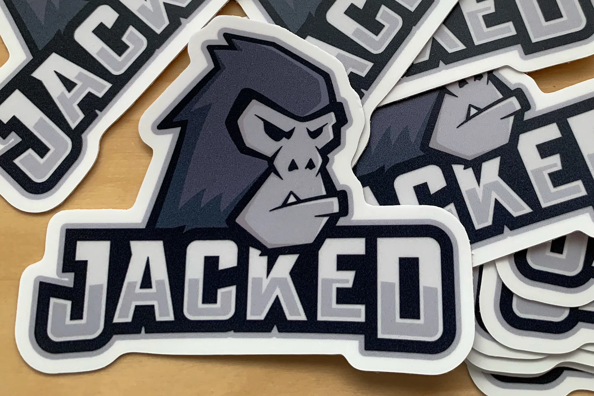
Based on this information, I knew we needed some powerful animal to represent the group. Given the amount of lifting and hanging athletes performed in class, a gorilla seemed like a natural fit.

")
 as 'The Rig.' (Image credit: Jean-Pierre Saintard)")


Process
My initial sketches were pretty literal, following the natural shape of a silverback gorilla’s head while using negative space to cut out its face. The animal’s elongated skull combined with the flattening effect of vector art created a distinct bon-bon shape that did not serve the concept well. I was equally disappointed with my early type treatments based on unruly wooden typography.
I spent another iteration redrawing the face and exploring additional texture elements to break up the smooth head but was still unsatisfied.
After another sketch session, I realized my mistake: I was taking this logo in a minimalist direction, when what it called for was a maximalist approach. My new areas of focus would be:
- Sports — Nobody does aggressive animals quite like professional sports teams. From charging bulls to screaming eagles, team logos have a sense of energy and drama. Their layered colors provide dimension and their sharp corners create an intimidating effect.
- Attitude — Jacked was meant to be a challenging class and the logo needed to reinforce that concept. Rather than focusing on smooth curves and on-model accuracy, I needed to play up the parts of the silverback that made it fearsome: their bulk, power, and ferocity.
This realignment led to my breakthrough: An angular three-quarter profile complete with furrowed brow, narrowed eyes, protruding lip, and visible teeth.


Outcome
When I delivered the final graphic, JP was ecstatic. The new Jacked logo was everything he’d hoped it would be: a sign of strength, ferocity, and determination that truly represented his training style. As a show of thanks for his patronage, I had a short run of decals printed for him to use as giveaways for the class.
Before we were able to make additional collateral based on the mark, COVID-related economic pressures forced JP to give up his full-sized studio and instead focus on 1-on-1 training at his home facility. Should he ever decide to reopen a larger gym, the Jacked brand is locked and loaded, ready to redeploy.


