API Editor
Product Feature Design
Cycle was an application built to streamline the testing of warehouse management systems. It could assess a test suite's change over time, monitor the throughput of a given system, and highlight errors when they arose. Though clients could easily test their own code and hardware, they lacked a straightforward way to check their connections.
Concept
Test suites were composed of a series of Feature files — documents containing a series of commands related to a given task, e.g. visiting a login screen, entering a username and password, then clicking submit. These files could then be combined into larger Playlists (sequential execution) or Group Tests (concurrent execution) and ran en masse. When one of these tests failed, users would go back to locate the error and begin their debug efforts there.
A test could fail for a number of reasons: an incorrect locator, poorly formed Scenarios, invalid Step syntax, etc. However, a Feature could be perfectly composed and still fail for reasons outside of a developer’s control, namely invalid or unreturned API requests.
Users wanted a way to quickly test an API without having to write an entire Feature dedicated to the task, especially if they were modifying a suite with many dependencies. My mission was to design a view that accepted the following:
- URL — The web address of the API to be tested.
- Method — The action to be performed, like GET or POST, to retrieve or send data, respectively.
- Body — Any content sent as part of a request.
- Headers — Text describing how the data transmitted was encoded.
- Queries — Additional text following a URL to help refine the data returned.
- Optional variables — A list of Cyclescript variables that allowed users to set dummy data to send as part of the test. Clients’ operations ran on sensitive information that was unsafe to store in their codebase, so these optional variables allowed testers to check the validity of a connection without revealing any secrets.
The request was to return the following:
- Duration — The total length of the operation from request to response; shorter is better.
- Status — A regular numerical code that indicated the outcome of the request, like 200 for success or 500 for internal server error.
- Body & Headers — Same as before, but from the server’s perspective.
Process
My first step toward a solution was to gather data from my users. I learned why the API Editor was important: Most Test Suites were deeply nested and contained many dependencies, which meant that an API request could take place at any point but not be easily separable from the code proceeding and following it. This new editor view would act as a way to isolate a single request and test it outside the regular flow of a Suite.
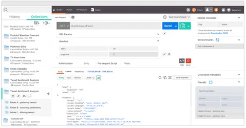
I also learned that most users were already attempting these ideas through third-party software like Postman. While useful in basic cases, these tools were of limited value due to dependency and security issues: There was no easy way to substitute the values required for a given request with non-sensitive data like usernames and passwords.
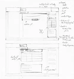
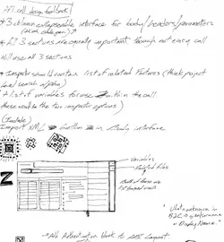
Once I understood the value of the feature as well as the software customers were currently using to replicate it, I got to work sketching potential layouts.
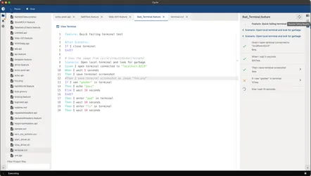
My first few sketches sought to understand where this particular feature should live. When initially designing Cycle, I landed on a three-panel layout: the panel furthest left would be for project-related data like a file tree, project settings, and notifications; the middle was a tabbed interface used to display working documents; and the far-right panel held detailed information regarding the open document or an item selected within it.
I figured the API Editor could live in one of two areas: the collapsable detail panel where it could be summoned as needed, or in the middle workspace as a tabbed document. Workspace-based views had the requirement of being read from a file, which I knew would have knock-on implications, so I brought my sketches to the rest of the Product team to discuss.
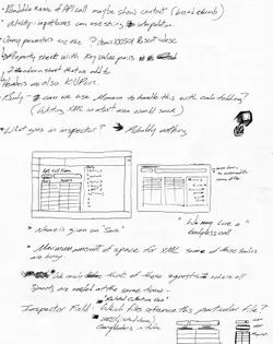
After refining the feature, we decided to make it file-based and place it within the main workspace. I performed a few more sketches exploring how the Body, Query, and Header sections would interact. My research had informed me that any given API call may have some or none of those three elements, so I decided to make them collapsable, that way Cycle users would be able to focus on the data that mattered without having to deal with empty UI.
Additionally, my research turned up a few easily implementable suggestions: A list to enter variables for substitution within the API request and a list to view what Feature files utilized this particular call. I decided to add these to a tabbed interface along with the actual response data from the server.
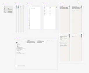
Now that the features were set, I took my sketches into Figma to create a prototype that I could show to stakeholders.
Prototype
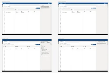
- In my prototype, I assumed a user to have typed in the necessary input data and were ready to click the Test API button.
- Clicking the button simulated a network delay, then returned a response from the server within the detail panel.
- I tucked the response headers away in a collapsible panel since they were typically less meaningful than the body of the response, but still could be useful for debugging errors.
- Since bad or broken requests are an inevitability during testing, I used the returned body’s copy button as a way to quickly demonstrate what an error state looked like.
- The detail panel also contained other tabbed views to aid in developing a request: a list of variables present in the body, other Feature files that utilize this particular request, and a place to offer dummy values for a one-off test.
- I designed the main three columns to be collapsible since not every request needs all three inputs. Users could then dedicate that real estate to the inputs that did matter.
- My prototype was approved and developed for version 2.16.
Outcome
The API Editor was released November 2023 as part of Cycle 2.16. I collaborated with teammate Andy to produce a video introducing the feature and explaining its usage and value.
My input and impact on this feature was significant:
- Increased clarity — By questioning the placement and constraints around this product feature, I was able to define more concrete requirements for my developers. More focused coding efforts means less wasted time.
- Decreased context switching — Eliminating the need to reach outside the Cycle application meant that clients could focus on their testing efforts instead of learning an unrelated tool.
- Increased time-in-app — A knock-on effect of reducing context switching was the increased amount of time users spent within Cycle, a meaningful metric to investors and leadership that signals the product has value and is on the right track.

